My role: As the only UX designer in the Machine Learning Solutions Lab, in this project I was in charge of the end-to-end UX process. I conducted UX research to identify/validate needs and define requirements. I generated initial design concepts and conducted feedback sessions to gather input and collect data to drive design iterations. I created prototypes and high-fidelity UIs, as well as the necessary assets required for implementation. All of this using a collaborative approach, working closely with the engineering team to rapidly identify optimal solutions that were feasible within the given time-frame. Also, I collaborated closely with PMs and business stakeholders to ensure the solutions meet business needs.
Health Data Insights (HDI) is a solution designed for medical professionals, that harnesses the power of machine learning (ML) to facilitate discovery of novel patient health insights. It leverages AWS’s state-of-the-art secure cloud infrastructure and deep learning algorithms to create rich visualizations of a patient’s longitudinal health as well as advanced capabilities to store, retrieve, and query healthcare data. HDI uses natural language processing (NLP) to automatically identify the most relevant information from unstructured data including medical conditions, medications and procedures with corresponding metadata such as ICD-10 ontologies or RX norms thereby reducing manual data entry and assisting in data driven decisions. Providing an easy to use interface and automating the medical comprehension process reduces the workload and makes it easier for healthcare professionals to focus on patient care.
The goal:
The goal was to create a healthcare-specific application, designed to showcase the power of Amazon HealthLake and other AWS ML Services, that aims at solving some of the largest problems in healthcare, as part of the official Amazon HealthLake launch during re:Invent 2021.
UX process:
Evaluative research: To achieve the vision outlined by stakeholders, our team came up with five (5) concepts that were technically feasible in the given timeframe and that were aligned with stakeholder and customer needs. Then, I conducted evaluative research with ten (10) participants to assess the overall vision, evaluate the concepts produced and to better understand the needs and expectations for data analysis and data visualization for the healthcare industry, that the service Amazon HealthLake can support. The research took place between April 14th and April 21, 2021 and consisted of 60-minute remote moderated sessions via Chime.
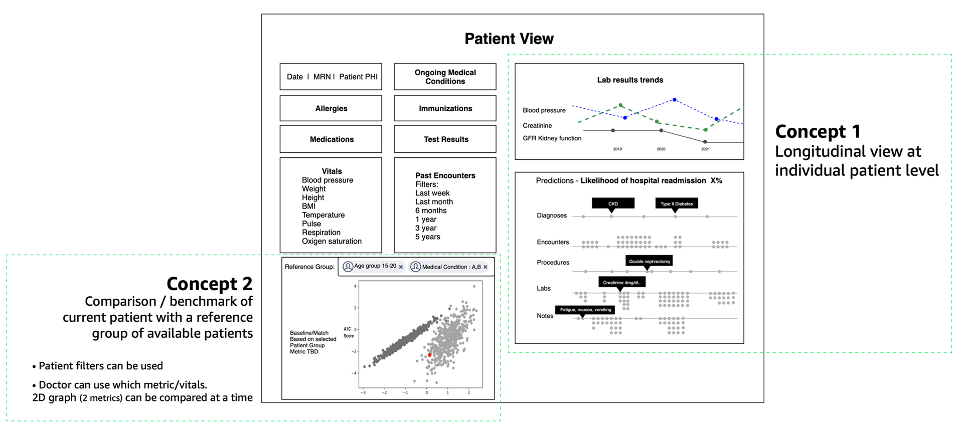
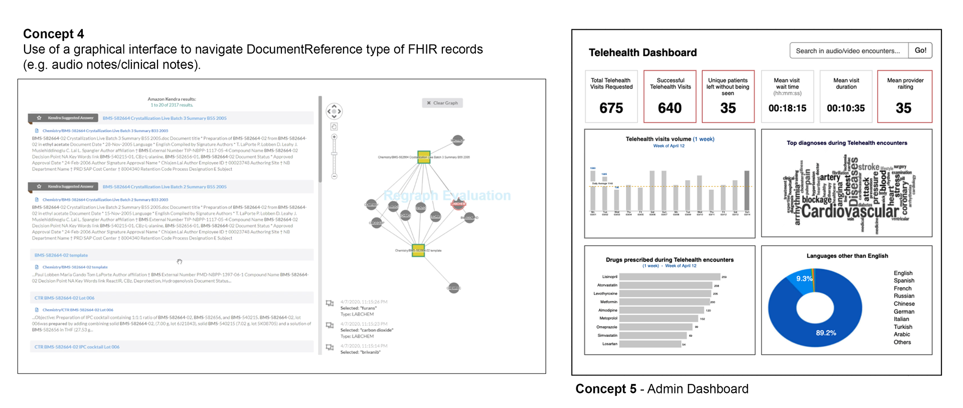
Concept presented were: 1. Visualization of patient’s clinical data in a timeline. 2. Comparison/benchmark of current patient with a reference group of available patients. 3. Add audio (unstructured data) can be added into HealthLake and medical entities are auto-identified to generate an encounter page. 4. Use of ML knowledge graphs to navigate DocumentReference type of FHIR records (written unstructured notes) . 5. Hospital Admin Dashboards (Hospital VS Telehealth).
Key insights and recommendations:
1. The visualization of patient’s clinical data in a timeline was by far the most exciting feature. Based on the data available at the start of the project and customer need, this concept was chosen as number 1.
2. Emphasize further the machine learning (ML) capabilities of Amazon HealthLake over EHR systems. Start with basic predictions and improve the predictions and the dataset used to train the models over time. Some ideas for basic predictions provided by the physicians during research include... Prediction of disease, disease progression and hospital readmission risk.
3. Make it easy to integrate into customer’s systems. Explainability, accuracy, trust and speed are themes consistently heard during research
4. Comparison / benchmark of current patient with a reference group of available patients was also well received, but the publicly dataset available to us, was not appropriate to execute this concept.
Design iterations
Several rounds of research and design iterations were performed to evolve and refine the concepts. A few highlights are described below.
Key insights:
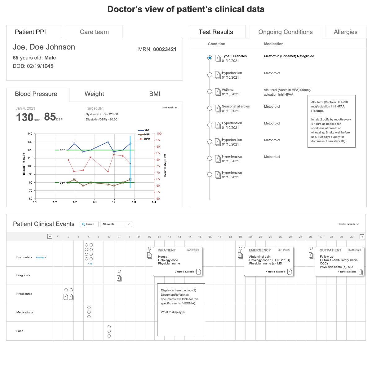
1. Research participants struggled switching tabs back and forth to see all patient information available.
2. It would take too many clicks for healthcare providers to dive deeper into each of the sections included in the design. Healthcare providers already struggle with EHR systems that use similar interaction patterns where users have to go several levels down to get the information needed. “ In healthcare, every click counts and every minute adds up. ”
2. It would take too many clicks for healthcare providers to dive deeper into each of the sections included in the design. Healthcare providers already struggle with EHR systems that use similar interaction patterns where users have to go several levels down to get the information needed. “ In healthcare, every click counts and every minute adds up. ”
3. Care team section was included in this concept, as patients with one or more chronic conditions, normally get assigned a group of HC providers to support them through their healthcare journey.
Some improvements made based on insights include:
● Removed tab components and instead presented the information all at once using a modular concept. Modules will make the design more flexible. Components can be automatically re-arranged based on data availability.
• Ongoing medical conditions, allergies and test results were also presented chronologically, highlighting the most useful information
• Added graphs to visualize the trends in lab results, blood pressure and body weight.
• In the "visualization of patient’s clinical data in a timeline" we added the ability to search by specific time-range or by date.
Insights and improvements:
• In the visualization of patient’s clinical data, users were frustrated to have to click on each one of the nodes to see all information available for each clinical event. The final concepts replace the nodes and instead, display a short description of each clinical event. Additional event information is available by hovering over the event.
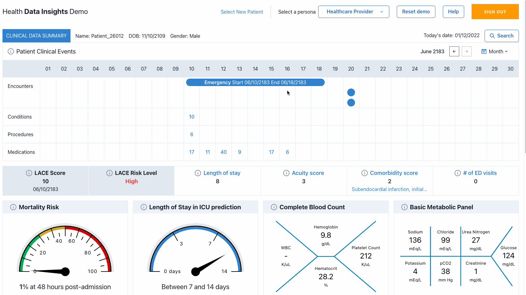
• The patient's timeline was moved to the top of the page. At the beginning, there were latency issues as the data was being called and displayed, so initial mocks had this component at the bottom of the page to give time for the data to load, but once the issues were resolved, we were able to push it to the top. Giving priority to the patient's timeline was also a consistent request from users that participated in user feedback sessions.
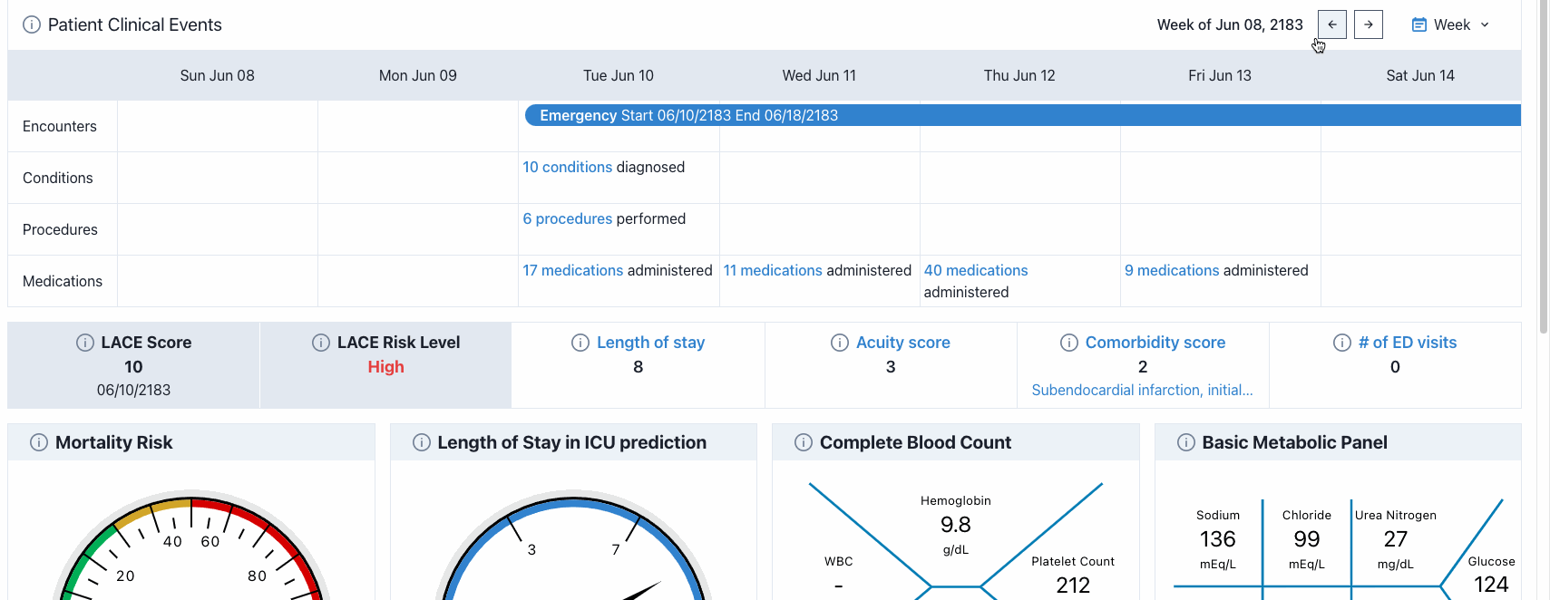
• Incorporated a fish-bone diagram format to represent lab results (complete blood count and basic metabolic panel). This was a concept suggested by a physician during our user-feedback sessions and we decided to incorporate it after the concept was shared and was well received by other participants.
Features included for in 2021 launch.
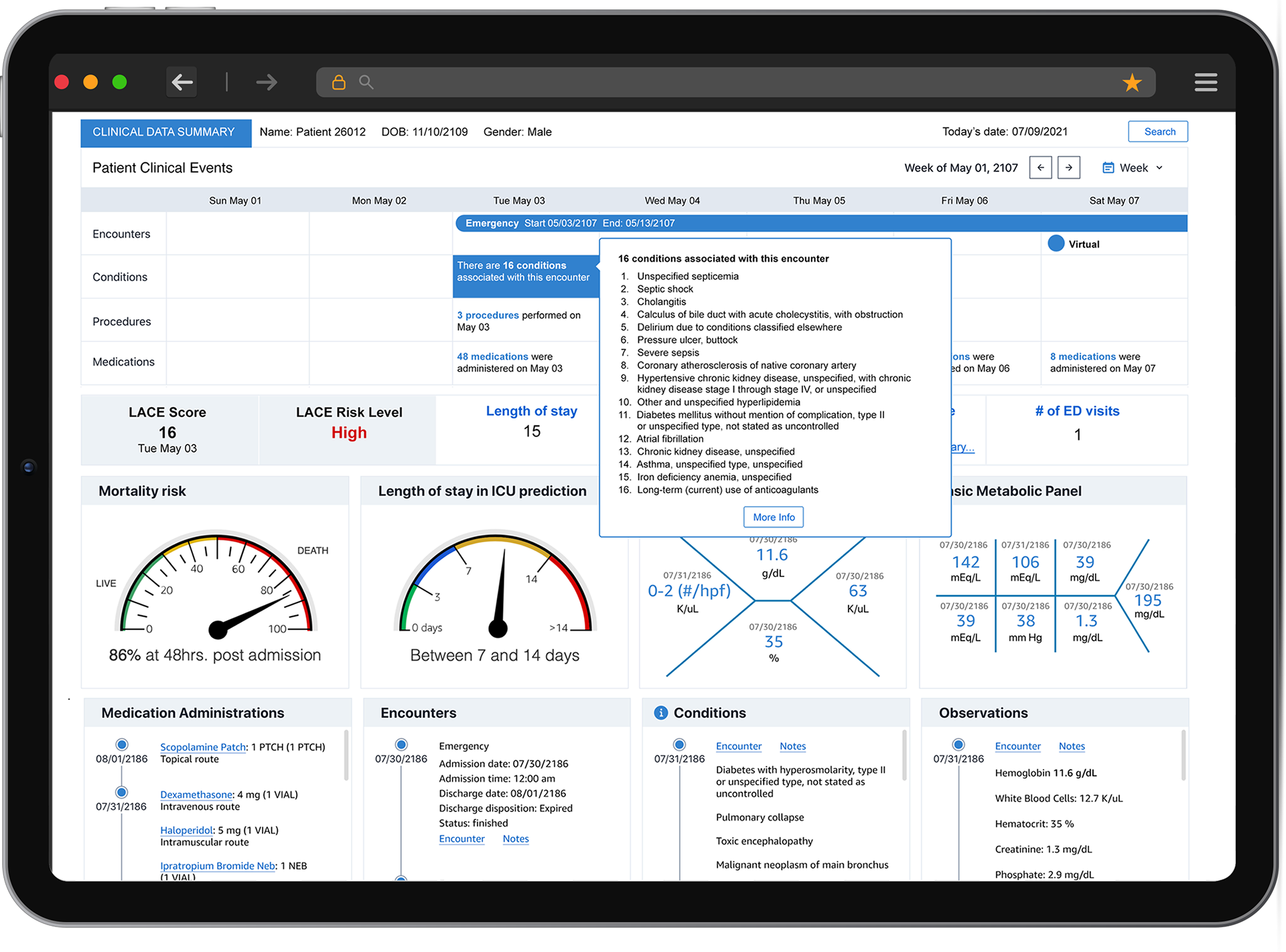
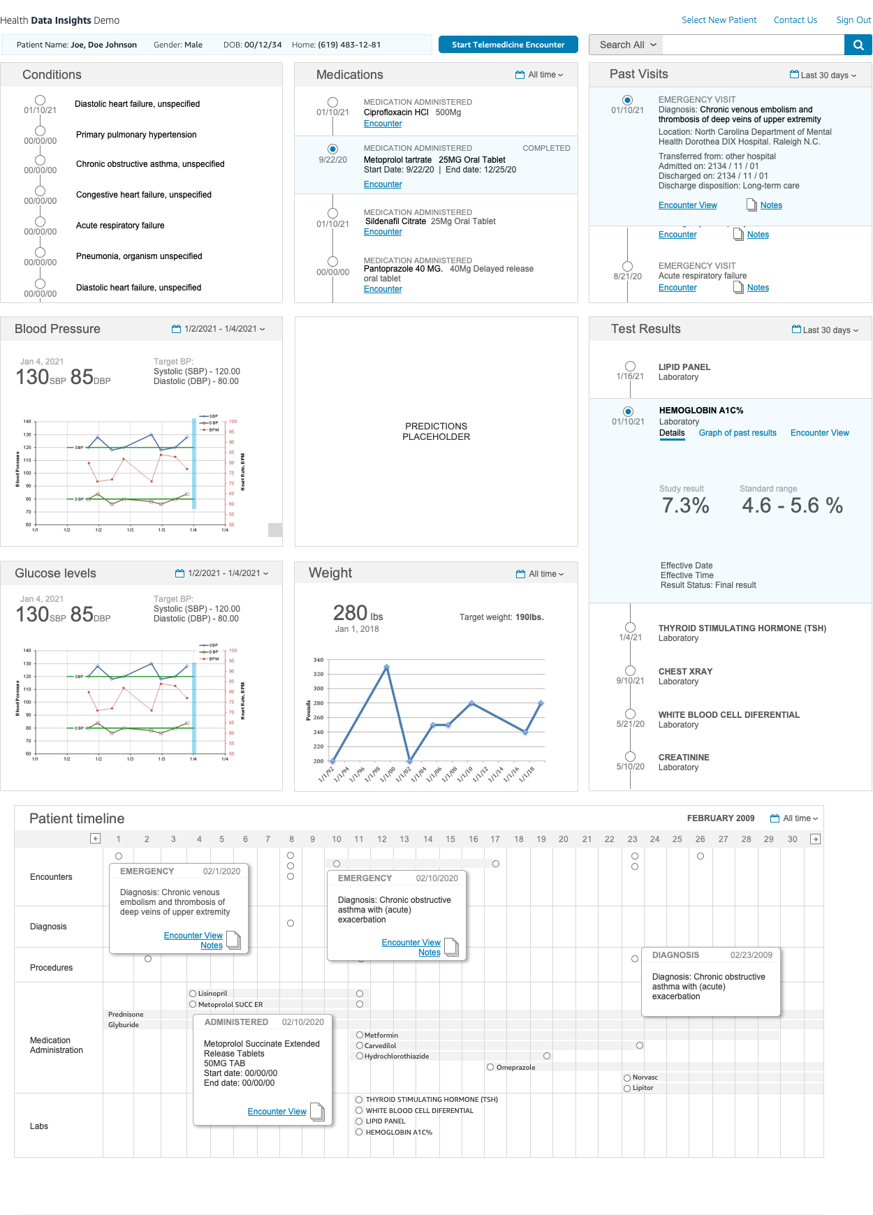
Dashboard / Patient Timeline
All recent encounters, diagnoses, procedures, and medications administered to the selected patient during the latest hospitalization are displayed on the timeline. You can hover over each cell in the timeline to see high-level information displayed in tooltips.
Additional encounter information is available by selecting the More Info button located at the bottom of the encounter tooltip. This will open a drawer that contains all the information available as well as any related document or notes related to the encounter.
The Notes tab includes encounter raw notes as well as other documentation related to the encounter.
To close the drawer, use the Close icon on the top-right corner or just click outside the drawer.
Lab Notations
Complete blood count and basic metabolic panel
Complete blood count and basic metabolic panel
The dashboard also displays lab notations for common observations including complete blood count and basic metabolic panel to provide faster access to the patient’s most recent lab results. Hover over any of the results to see the standard range expected for any particular observations.
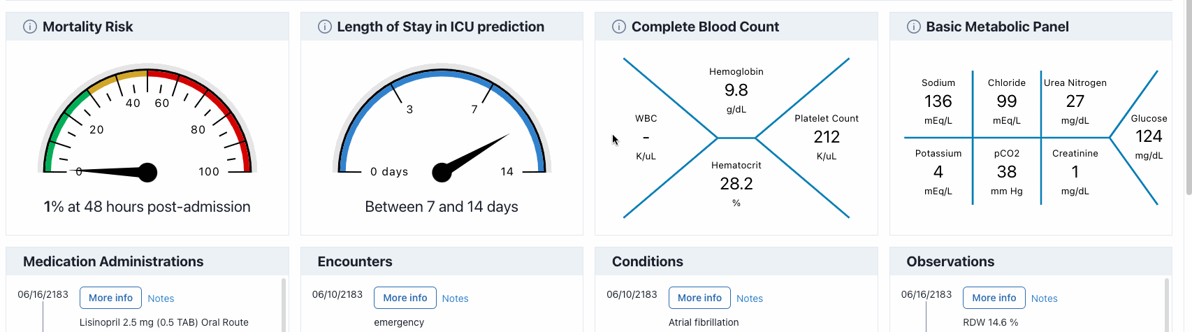
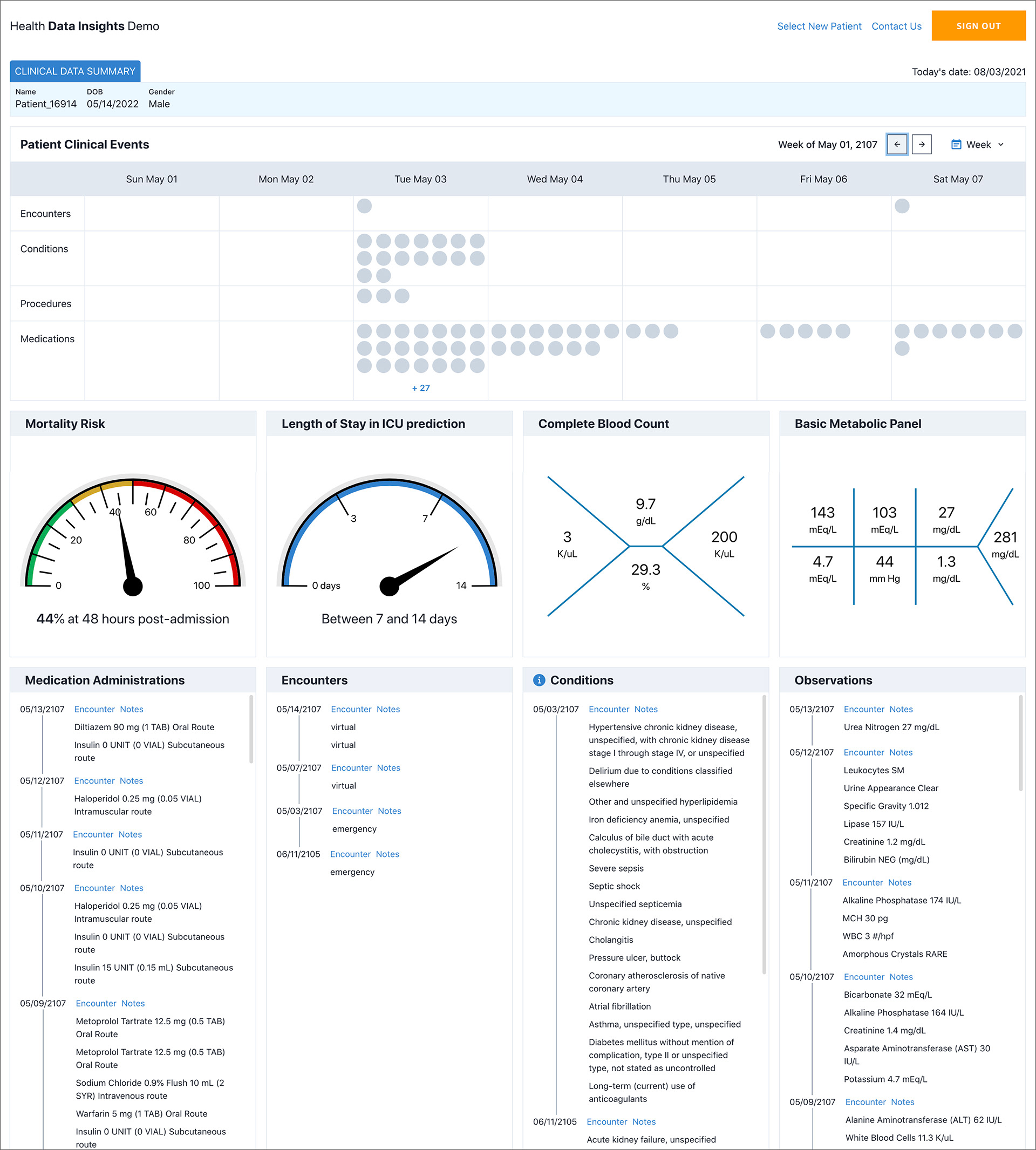
ML Models
HDI includes two ML models to assist with data driven decisions. Length of stay in the ICU and 2) Mortality risk.
These predictive models were trained using the MIMIC-III dataset. By training on the rich and real medical data available in MIMIC 3 dataset, the ML models are able to find patterns and relationships that are not easily identifiable by humans and use that information to make predictions.
These predictive models were trained using the MIMIC-III dataset. By training on the rich and real medical data available in MIMIC 3 dataset, the ML models are able to find patterns and relationships that are not easily identifiable by humans and use that information to make predictions.
For more information you can select the more info icon to see more about the Mortality Risk and Length of Stay ML models.
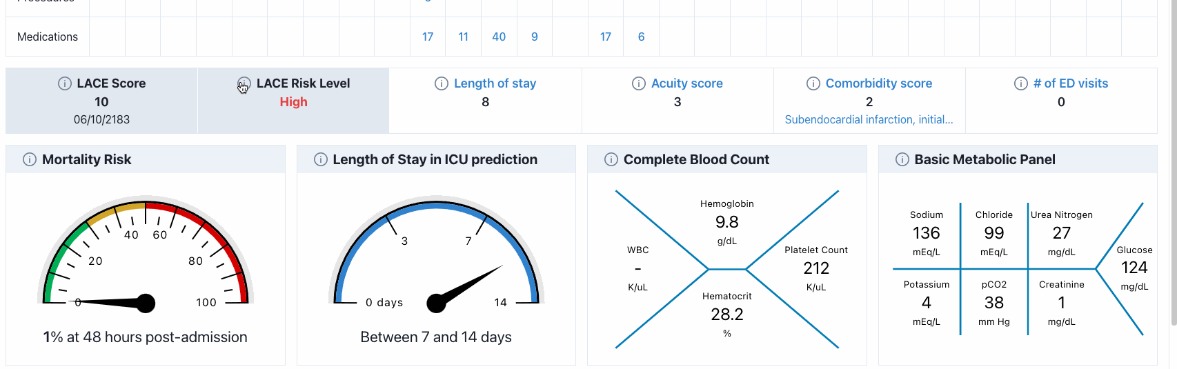
Length of stay in the ICU: Given the patient’s admission notes at admission time, the model can predict a time range in which the patient may stay in the ICU.
Mortality risk: Given the patient’s information (including observations and lab results) available within 48 hours since admissions, what is the mortality risk associated with the patient during the rest of ICU stay.