Background
Amazon SageMaker Ground Truth is a data labeling service that supports image, video, text, and 3D point cloud annotations. As part of its quality control system, the Review UI allows annotators to verify and correct labels—critical for maintaining training data accuracy.

The problem: 
The original Review UI was slowing teams down: 
•Manual issue logging forced context switching 
•Cluttered layouts made label interactions difficult 
•Visual overload reduced efficiency, especially on video and 3D tasks 
•Filters and attributes were hard to use and often ignored 
Annotators faced fatigue, high error rates, and inefficient workflows that the product team hadn't fully scoped.

My Role:
I was the sole UX designer on this 6-week initiative. I led the end-to-end design process: 
•Conducted research with 15 stakeholders, including QC reviewers and engineers 
•Mapped workflows and surfaced unaddressed product gaps 
•Created and validated design concepts through structured usability sessions 
•Delivered production-ready designs aligned with user needs and technical feasibility 
Team: 1 PM, 1 SDM, 3 Front-End Engineers, 1 Data Scientist, and myself as the UX designer.
UI before the UX optimization.

Discovery & Research
To redesign the Review UI for maximum usability and impact, I conducted a structured, multi-phase research process to uncover the real-world workflows, challenges, and needs of users involved in quality verification tasks within Amazon SageMaker Ground Truth.
This research was critical in exposing gaps in the original product design and aligning the UI with how different user types actually interact with the system—especially in high-effort tasks like video and 3D point cloud annotation.
Personas and end-to-end journey
Personas. Jobs to be done

--------------------------------------------------------------------------------------------------------------

Research Methodology
To redesign the Review UI for Amazon SageMaker Ground Truth, I followed a structured three-phase, end-to-end UX research and design process. This approach ensured the final solution addressed real user workflows, balanced technical feasibility, and aligned with business priorities.

Phase 1:
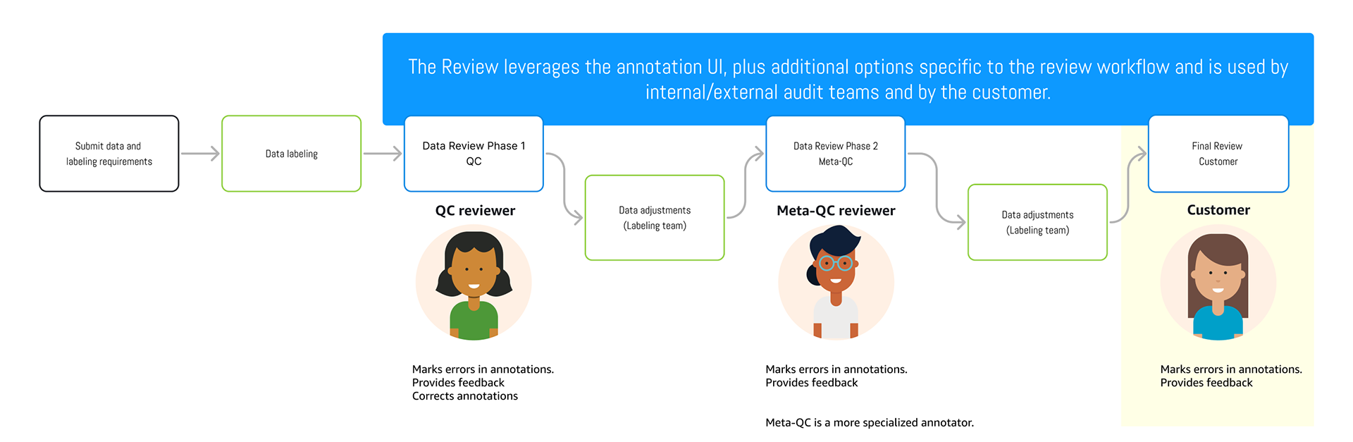
Understand the Problem & Generate Early Concepts
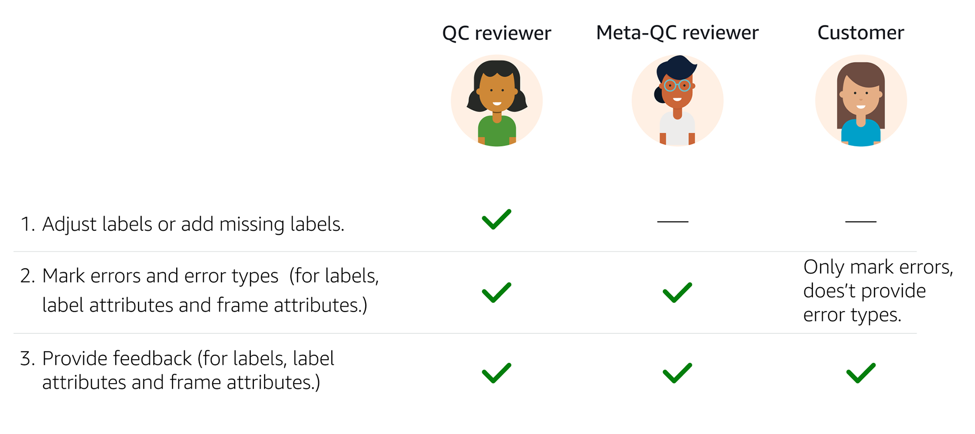
• Audited the current UI and documentation to identify known limitations and pain points 
• Met with internal stakeholders to understand business goals, technical constraints, and product assumptions
• Reviewed platform usage analytics and user-submitted feedback to identify recurring usability issues
• Conducted initial user interviews to uncover unspoken workflow inefficiencies, especially in high-effort tasks like video and 3D point cloud review 
• Identified new product requirements based on observed behaviors that were not previously captured
• Created early design concepts to address key usability and workflow issues

Top Pain Points Identified (Phase 1 Findings)
These problems consistently surfaced during interviews, platform audits, and user observations:

1. Usability Issues in the Right Panel
Label interactions were difficult due to poor layout, unclear hierarchies, and dense UI.


“It’s hard to know which label I’m editing — everything feels stacked and cluttered.”
– QC Reviewer

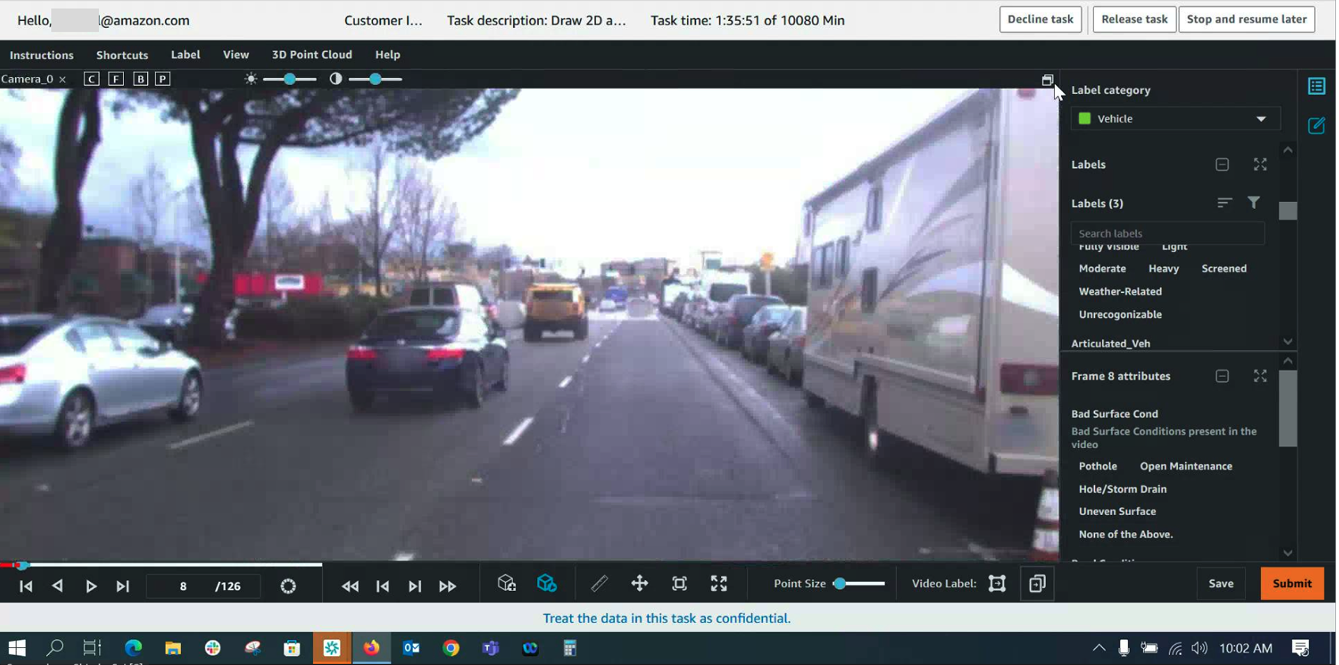
Original label panel UI, where users struggled with click targets, visibility, and navigation.

2. Manual and Time-Consuming Error Reporting​​​​​​​
Reviewers had to log issues in external spreadsheets or chat tools, disrupting their flow.

“By the time I log the issue and come back, I’ve lost my place.” –
Meta-QC Reviewer

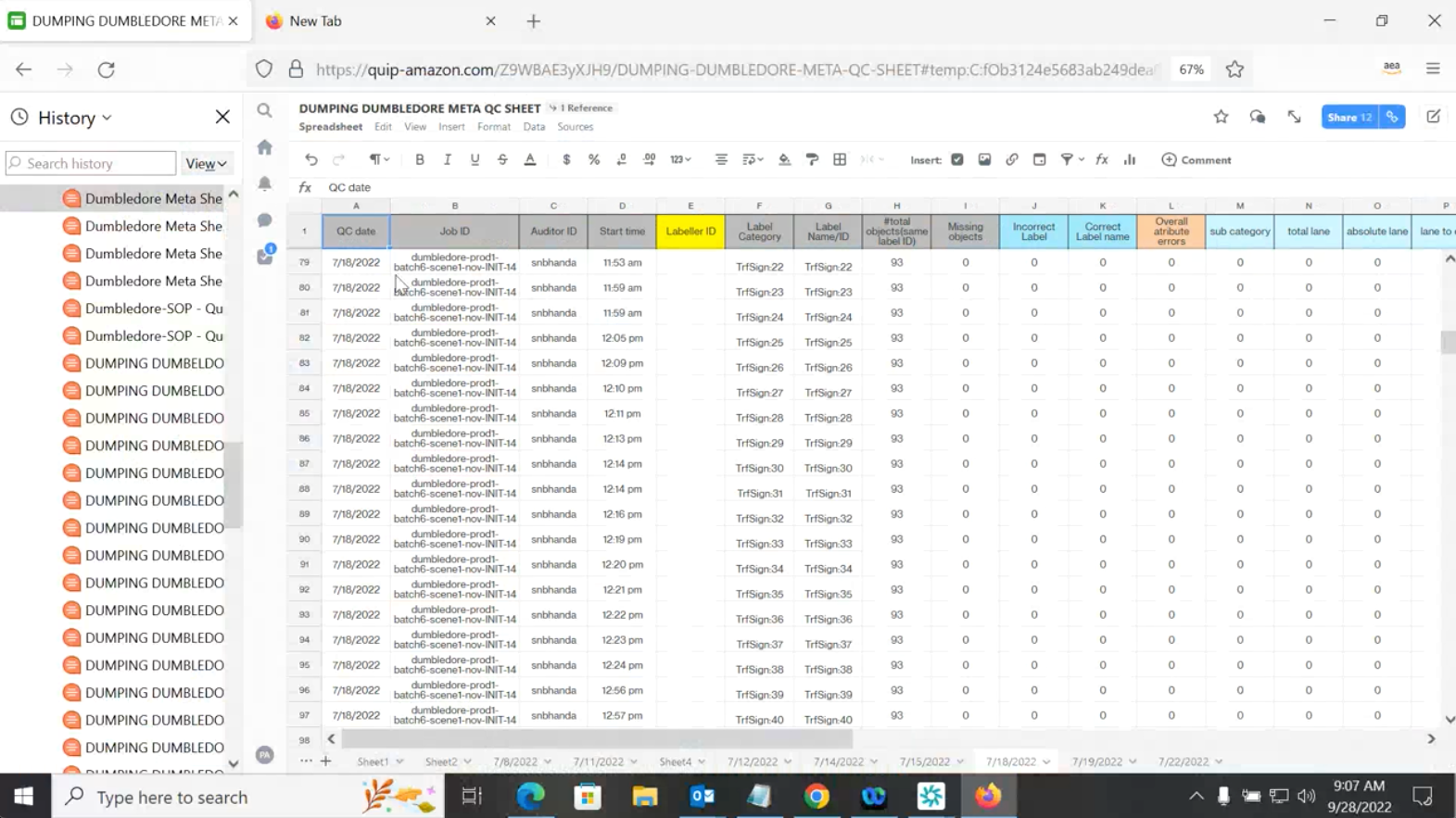
Fragmented error reporting process outside the tool.

--
3. Confusing Label Visualization

Label sets in complex tasks (20+ labels) were overwhelming and hard to navigate. Users struggled to: 
•Differentiate between labels 
•Track which were already reviewed or modified
•Maintain context while zooming or switching views

 “I keep clicking the wrong label — there are just too many to keep track of visually.”
QC Reviewer

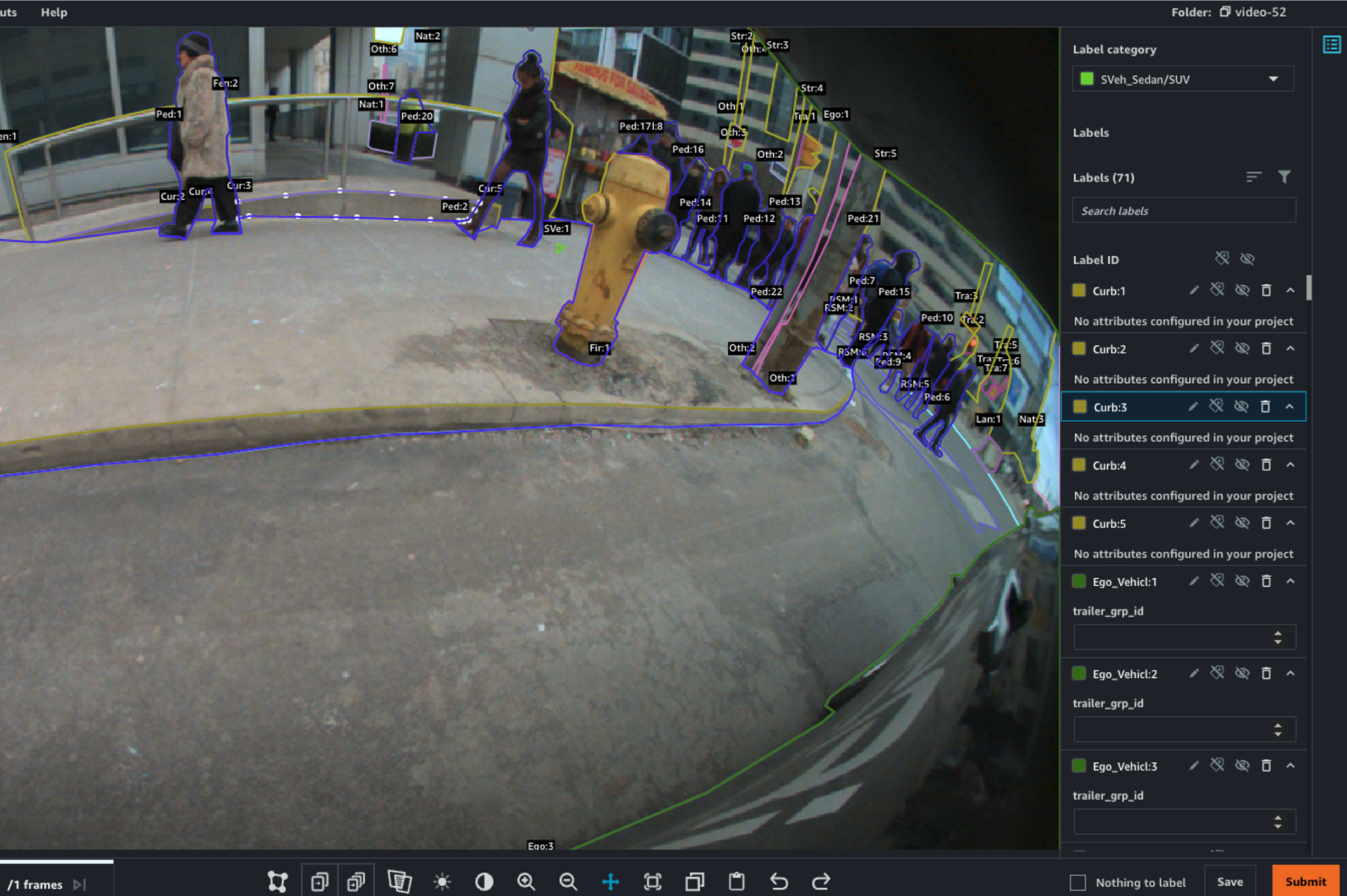
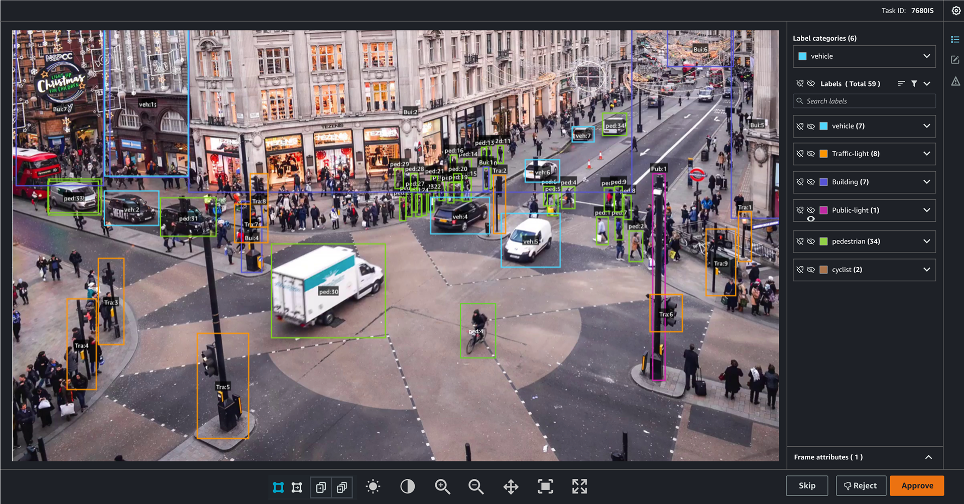
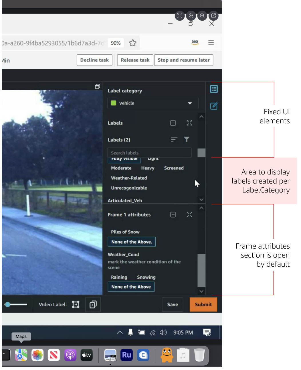
Label-heavy UI that caused visual overload in dense review tasks.

4. Ineffective Attribute Filters

Filters were rarely used due to confusing logic and lack of relevance to user tasks. Common feedback included: 
•Filters were too generic 
•Results didn’t update dynamically 
•Filter placement wasn’t intuitive 

“I don’t even bother using filters — they don’t do what I expect.”
QC Reviewer

Attribute filtering options that failed to support reviewer needs.


Phase 1: Early Design concepts
To address the top pain points uncovered in Phase 1, I developed several low- and mid-fidelity design concepts that focused on: 
•Reducing visual and cognitive overload 
•Streamlining feedback workflows 
•Enhancing label organization and navigation 
•Improving reviewer speed and task clarity 

These concepts were shared and tested in Phase 2 to validate impact and guide feature prioritization.

Concept 1: LabelCategory Overview & Organization
Addressed issues related to label overload and panel usability.

•Display a high-level summary of each LabelCategory, with counts (e.g., Pedestrians: 34, Vehicles: 15) 
•Default to collapsed view, giving users a bird’s-eye view without overwhelming them 
•Add expand/collapse functionality so users can drill into specific categories as needed
Concept mock showing LabelCategory overview with collapsible sections and per-category label counts.
Concept 2: Contextual Attribute Display
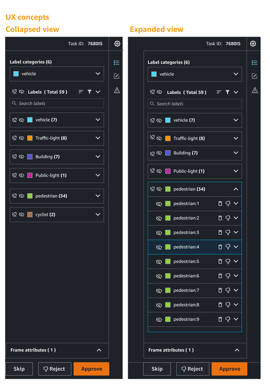
Solved for visual overload by showing information only when needed.

•Attributes are hidden by default to reduce clutter 
•When a label is selected, attributes appear contextually in the right column and near the object in the preview area

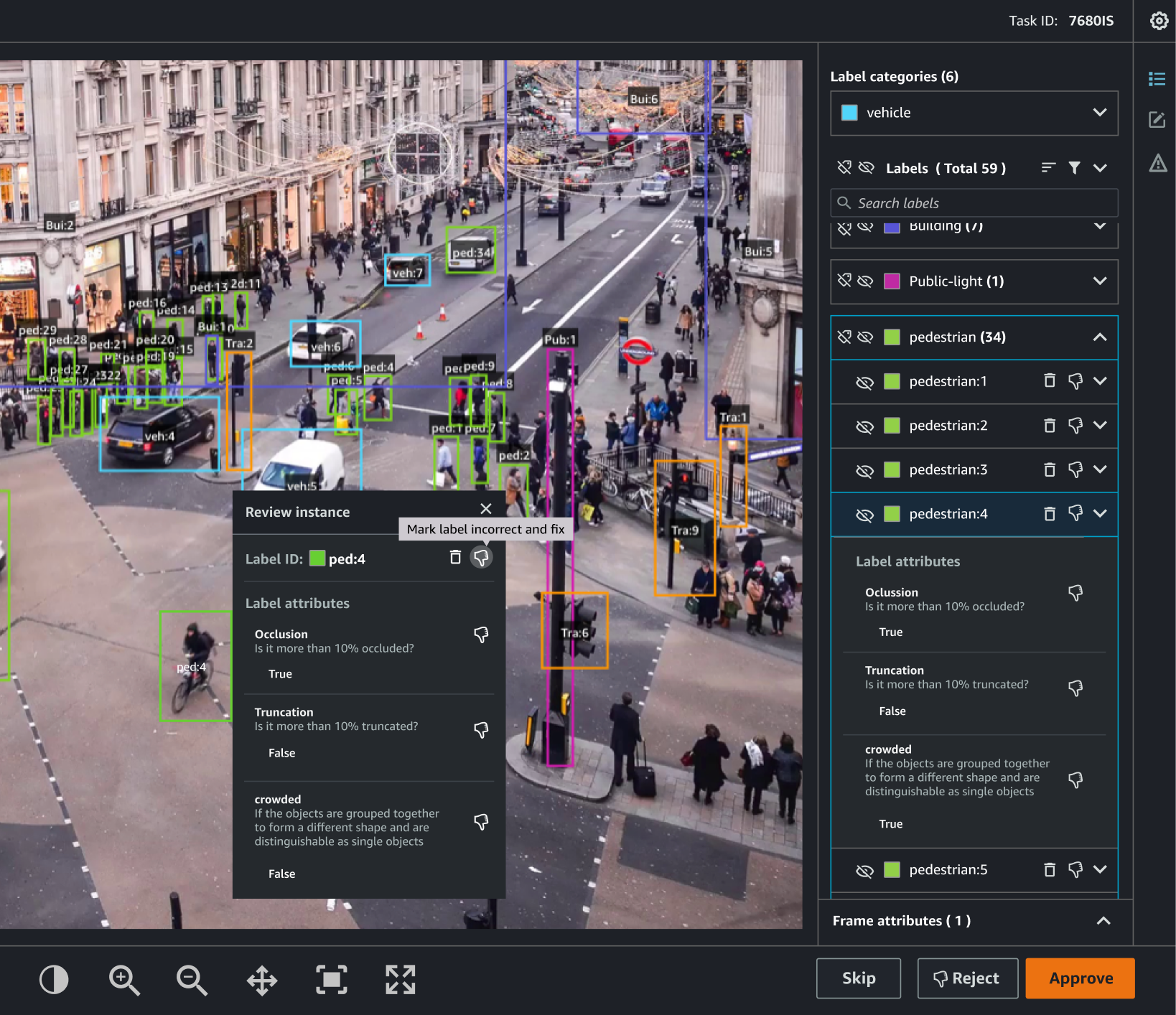
Concept showing contextual reveal of label attributes upon selection.


Concept 3: In-Frame Feedback & Error Marking
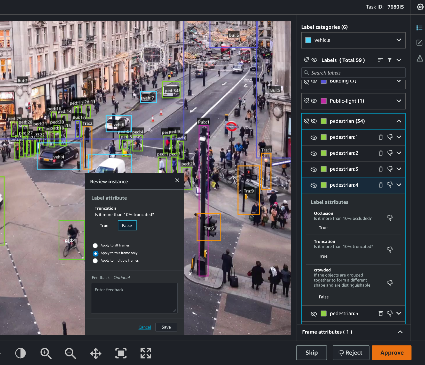
Designed to reduce context switching and improve speed of error reporting.

•Let users mark errors directly in the preview frame, rather than typing feedback 
•Replace comment box with click-to-mark interaction to reduce review time from minutes to seconds

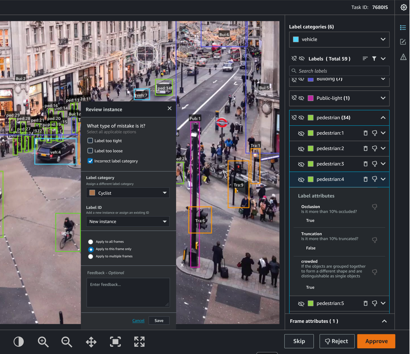
In-frame feedback interaction, replacing text entry with direct label marking.

Concept 4: Group Feedback Actions

Addressed inefficiencies in repetitive error tagging across similar items.
•Enable batch feedback to a LabelCategory, label-attribute, or all labels in a given frame 
•Especially useful for high-volume tasks like video object tracking and 3D point cloud jobs

Batch feedback tool supporting label category- or frame-wide actions.


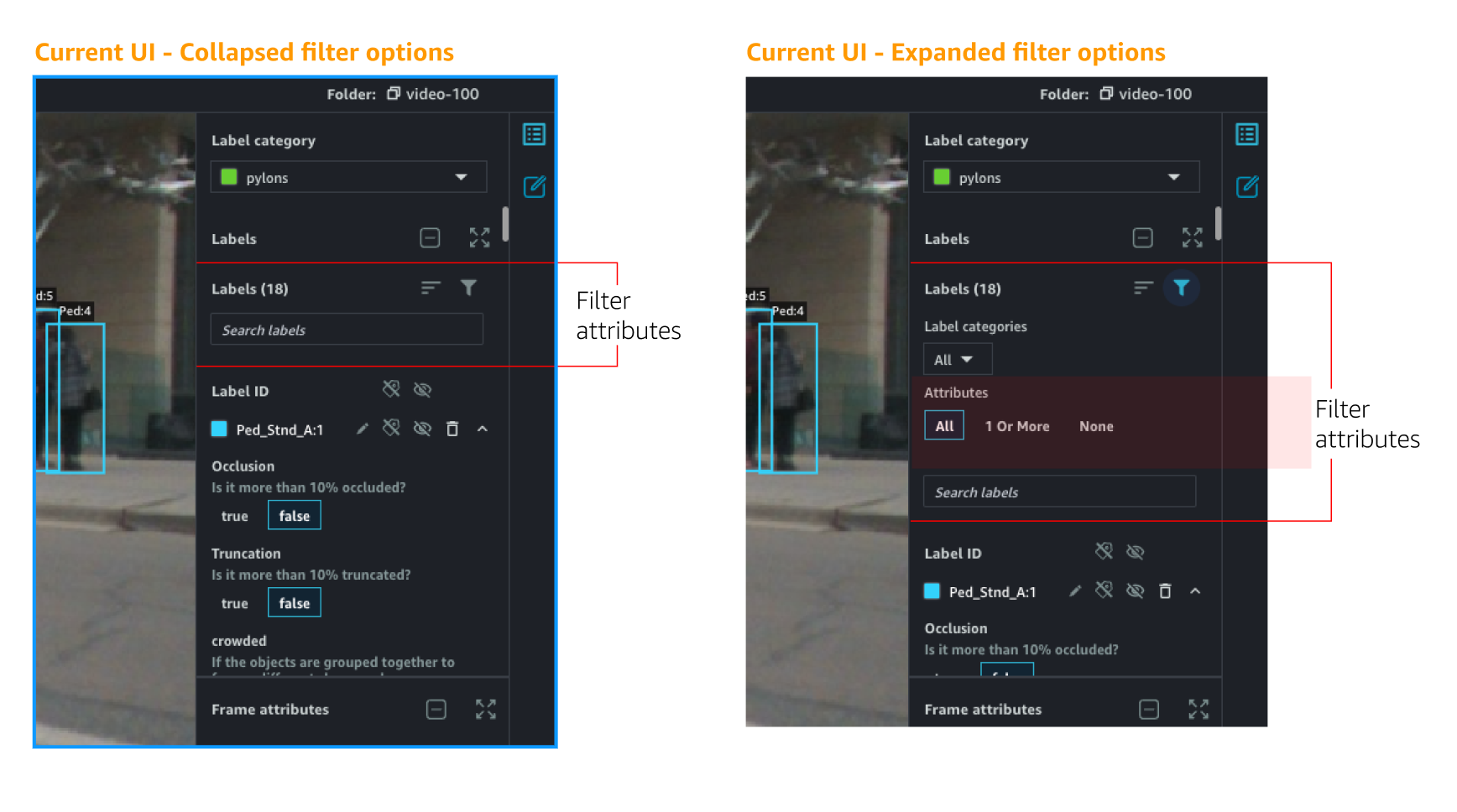
Concept 5: Multi-Select Attribute Filtering with Search

Improved attribute filter usability by enabling precise, multi-select search.
•Multi-select dropdown menu to choose multiple attributes at once
•Auto-complete search bar for fast lookup of attribute names

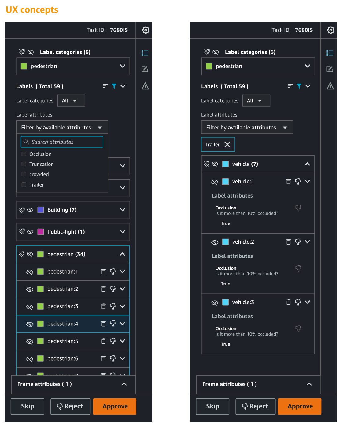
Enhanced filter UI with multi-select and auto-complete functionality.

With the most critical usability issues uncovered and initial design solutions mapped out, I moved into Phase 2 to rigorously test these ideas. This phase focused on validating the proposed improvements with the people who would use—and build—them, ensuring every decision balanced user impact with technical feasibility.

--------------------------------------------------------------------------------------------------------------
Phase 2: Validate Concepts & Prioritize Improvements
With early design concepts developed, Phase 2 focused on validating the proposed solutions through in-depth, structured feedback. I conducted 15 one-on-one research sessions with stakeholders to assess usability, value, and feasibility of the features—and to inform prioritization with both qualitative and quantitative input.

Participant profiles
• 8 End Users (QC and Meta-QC reviewers):Participated in guided evaluations to assess how proposed features would affect their workflow. Feedback focused on improvements to speed, accuracy, and usability.
• 6 Engineers:
Provided estimates on technical effort for each feature. Helped evaluate trade-offs between feasibility and user impact during prioritization exercises.
• 1 Machine Learning Scientist:
Collaborated to identify opportunities for automation and scalable improvements via ML-assisted tooling.

Feature Evaluation Tools Used During Interviews
To capture structured feedback during the interviews, I used two tailored survey-style evaluation frameworks—one for end users and one for engineers. These tools were not deployed as standalone surveys but were used live during each session.

​​​​​​​
​​​​​​​End-User Evaluation Framework

Goal: Understand perceived usefulness of each feature in improving job efficiency and annotation accuracy. 

Participants were asked to rate each concept from “Extremely Useful” to “Not Useful at All” based on how it would impact their daily workflow.

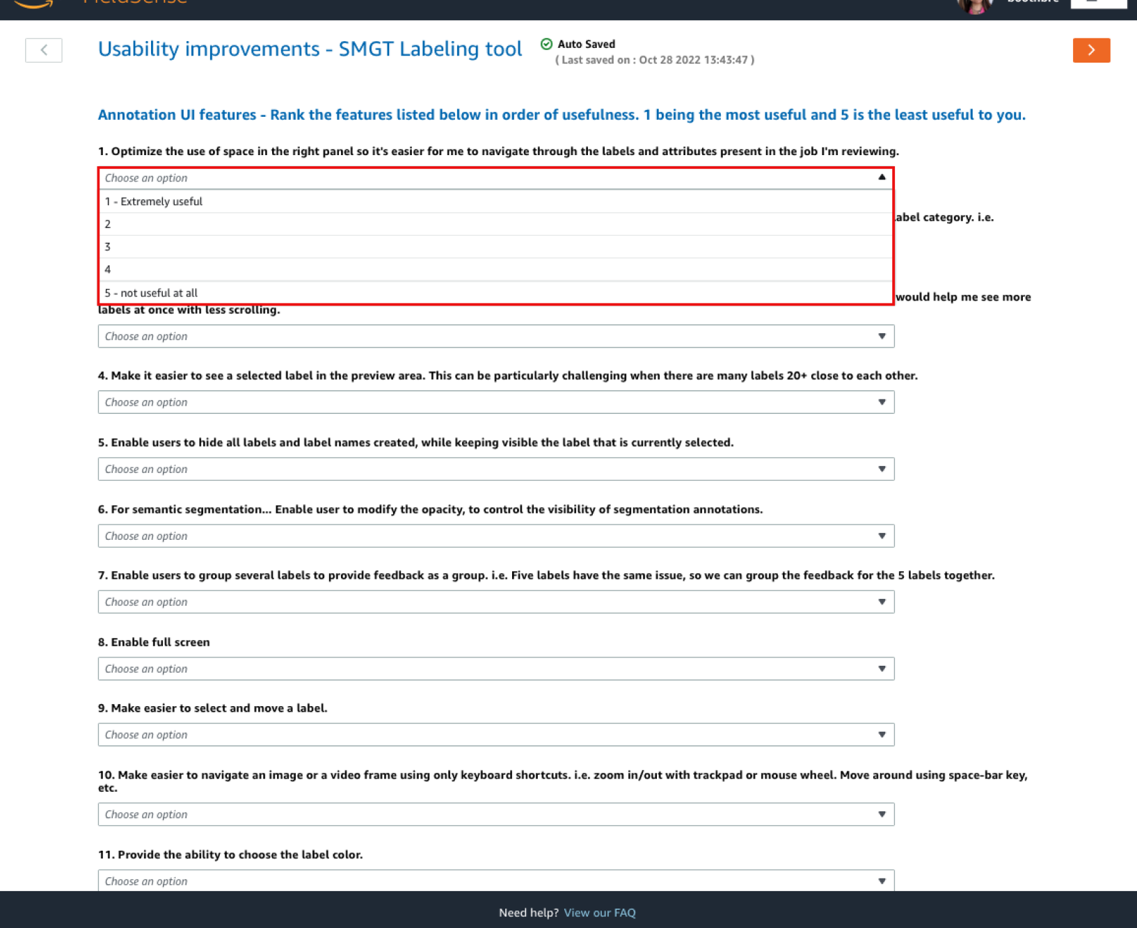
Feature rating scale used with end users to assess perceived value of each proposed concept.

Engineer Evaluation Framework

Goal: Estimate implementation effort for each feature.
Engineers rated concepts using relative effort tiers (e.g., XS = minimal, S = manageable, M = moderate, L = complex), helping surface quick wins and high-cost risks.
​​​​​​​

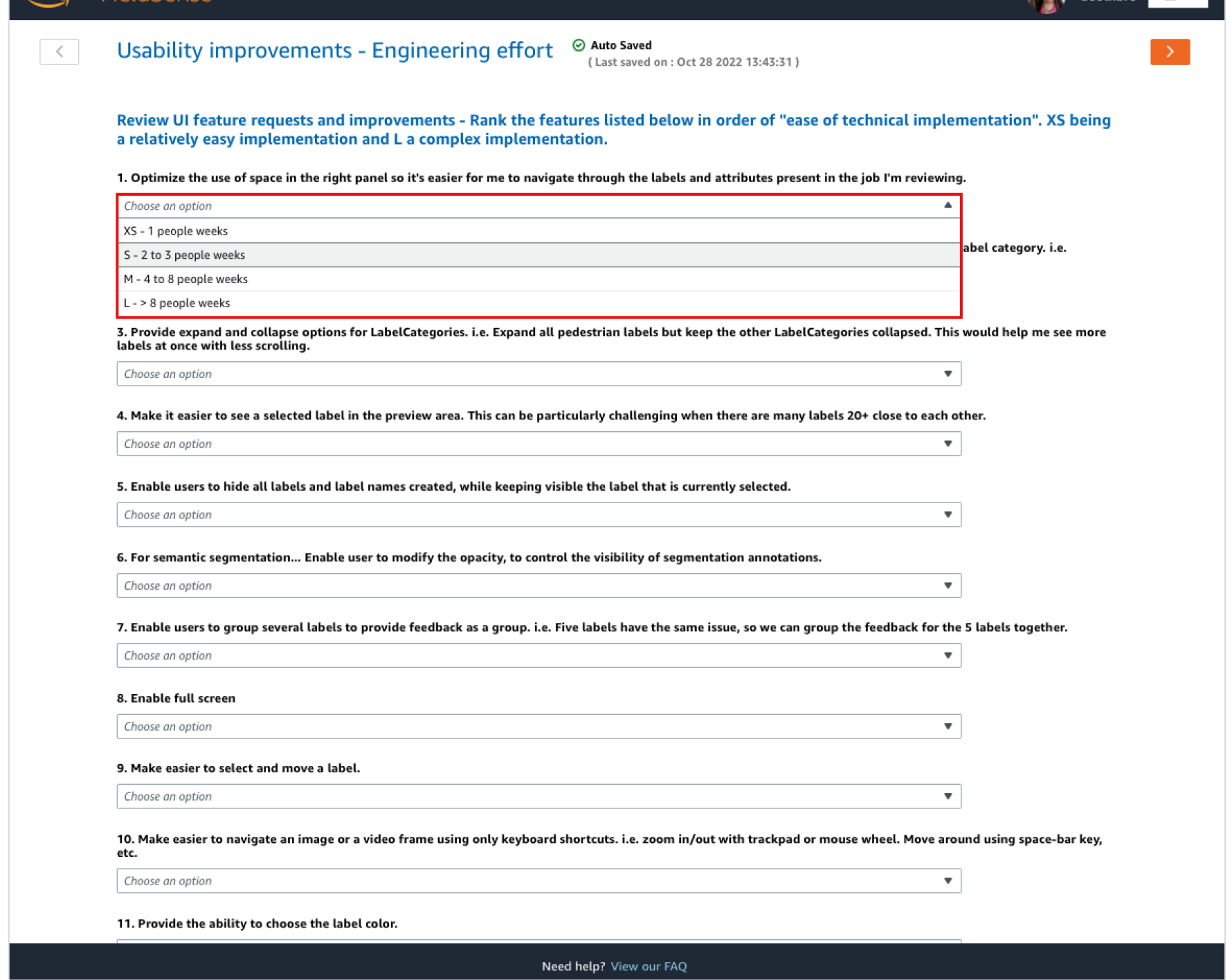
Technical evaluation worksheet used during 1:1 sessions with engineers.

Recommended Prioritization Matrix
To synthesize findings across all interviews, I created a prioritization matrix combining:

•Feature usefulness ratings from end users
•Implementation effort estimates from engineers
•Additional insights from interviews and feasibility discussions

This matrix directly informed the final feature roadmap and guided which concepts would move forward into iteration in Phase 3.

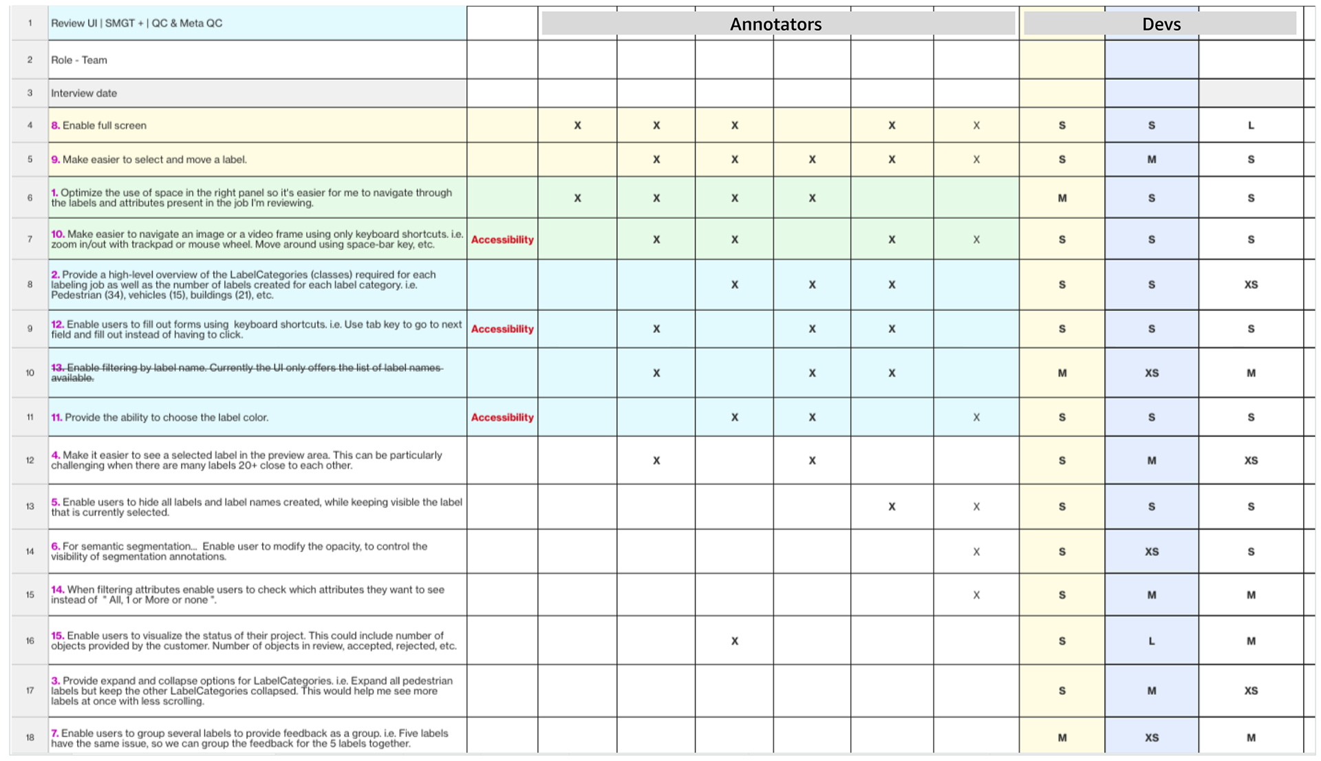
Final prioritization matrix used to align the product team on high-impact, feasible improvements.


--------------------------------------------------------------------------------------------------------------
Phase 3: Final Iteration & Design Refinement

With prioritized insights and structured feedback from Phase 2, I entered Phase 3 focused on refining the most impactful concepts through targeted design iterations. This phase was centered on implementing feedback, improving usability details, and preparing the final designs for release.
I conducted a final round of usability validation to ensure the interface was intuitive, efficient, and aligned with real-world reviewer needs.​​​​​​​
Impact
The redesigned Review UI had immediate, measurable benefits for data annotators and project teams. Within the first month of release, annotation review times dropped by 40%, significantly accelerating project delivery timelines. More importantly, annotation accuracy increased by 35%, reducing downstream QA effort and improving the quality of ML training data across use cases.
Beyond the metrics, this work had a meaningful human impact. Annotators reported higher job satisfaction and reduced burnout, citing the streamlined workflow and in-frame error reporting as major quality-of-life improvements. For a team often working behind the scenes, these upgrades directly improved day-to-day experience—demonstrating how thoughtful UX design can transform even the most operational tools.

Closing Thoughts
This project was especially rewarding because of its immediate and tangible impact on the people behind the screen. By meeting directly with reviewers, I witnessed the frustrations of inefficient tools and the relief when those issues were addressed. It was a reminder that even technical workflows rooted in ML infrastructure benefit deeply from human-centered design. This experience reinforced my passion for designing tools that not only improve accuracy and efficiency—but make work feel better for the people doing it.

Back to Top